
Introduction
In today’s data-driven world, the ability to present complex information in an accessible, engaging, and meaningful way has become an essential skill. Tableau has emerged as a powerful tool for data visualization, enabling analysts and business professionals to transform raw data into insightful tableau-dashboards. However, creating truly effective dashboards requires more than just technical proficiency—it demands a deep understanding of design principles, user experience, and the art of visual storytelling.
When designed thoughtfully, dashboards serve as a bridge between complex data and human understanding. They enable stakeholders to quickly grasp trends, identify outliers, and make informed decisions. Tableau’s versatility makes it particularly well-suited for this purpose, offering a rich set of features that can be leveraged to create dashboards that are both analytically rigorous and visually compelling.
In this comprehensive guide, we’ll explore advanced dashboards design principles in Tableau that will help you create visualizations that not only communicate data effectively but also engage and captivate your audience. We’ll delve into fundamental design concepts, advanced techniques, performance optimization strategies, and real-world case studies that demonstrate these principles in action.
Fundamental Tableau-Dashboards Design Principles
Data-Driven Decision Making
At the core of every effective dashboard is a clear purpose: to facilitate data-driven decision making. Before diving into the technical aspects of dashboard creation, it’s crucial to understand the specific questions your dashboard aims to answer and the decisions it needs to support.
Start by identifying your key stakeholders and understanding their information needs. What decisions will they make based on your dashboard? What metrics matter most to them? What actions should they be able to take after reviewing the data? Answering these questions will help you determine the most relevant data to include and the most appropriate visualizations to use.
Remember that the goal isn’t to display all available data, but rather to present the right data in the right way to support specific decisions. This focused approach helps prevent information overload and ensures that your dashboard remains relevant and actionable.
Clarity and Simplicity
One of the most important principles in dashboard design is clarity. Your dashboard should communicate insights clearly and efficiently, without requiring excessive cognitive effort from the user. This means embracing simplicity and avoiding unnecessary complexity.
Here are some key strategies for enhancing clarity:
- Remove clutter: Eliminate any visual elements that don’t contribute to understanding, including excessive grid lines, unnecessary text, and decorative graphics.
- Prioritize information: Arrange your visualizations in order of importance, with the most critical metrics receiving the most prominent placement.
- Use white space effectively: Provide adequate spacing between elements to create visual separation and make your dashboard easier to scan.
- Apply consistent formatting: Use consistent colors, fonts, and styling throughout your dashboard to create a cohesive visual language.
Edward Tufte, a pioneer in data visualization, introduced the concept of “data-ink ratio,” which suggests that the ink used in a visualization should be dedicated to representing data, not decorative elements. This principle is particularly relevant in dashboard design, where every pixel should serve a purpose.
Intuitive User Experience
An effective dashboard should be intuitive to use, allowing users to navigate and interact with the data without confusion or frustration. This requires thoughtful consideration of user experience (UX) principles.
Start by organizing your dashboard in a logical manner. Place related visualizations near each other and use clear, descriptive titles and labels to help users understand what they’re looking at. Consider the natural reading pattern of your audience—in Western cultures, this typically follows an F-shaped pattern, with users scanning from left to right and top to bottom.
Incorporate clear visual cues to guide users through your dashboard. Use color, size, and positioning to highlight important information and create a visual hierarchy. For example, you might use a larger font size for key metrics or a contrasting color for critical alerts.
Additionally, provide context to help users interpret the data correctly. This might include reference lines showing targets or historical averages, text annotations explaining unusual patterns, or comparative metrics showing performance relative to benchmarks.

Advanced Tableau-Dashboards Design Techniques
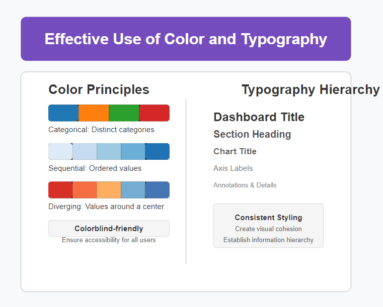
Effective Use of Color and Typography in Tableau-Dashboards
Color and typography are powerful tools in dashboard design, capable of enhancing understanding, guiding attention, and creating emotional responses. Used effectively, they can transform a functional dashboard into a compelling visual experience.
When selecting colors for your dashboard, consider both aesthetic appeal and functional clarity. Here are some guidelines:
- Use color purposefully: Each color in your dashboard should serve a specific function, whether it’s to highlight important data, create categorical distinctions, or represent values on a continuous scale.
- Maintain consistency: Use the same color to represent the same data element throughout your dashboard to avoid confusion.
- Consider color blindness: Approximately 8% of men and 0.5% of women experience some form of color blindness. Choose color palettes that are accessible to these users, avoiding combinations like red and green.
- Leverage color psychology: Colors can evoke specific emotions and associations. For example, red often signifies urgency or danger, while blue conveys trust and stability.
Tableau offers a variety of built-in color palettes, including categorical, sequential, and diverging options. You can also create custom color palettes to align with your organization’s branding or specific visualization needs.
Typography is equally important in dashboard design. Choose fonts that are legible at different sizes and that complement your overall design aesthetic. Use typographic hierarchy—varying font sizes, weights, and styles—to establish importance and guide users through your dashboard.
Leveraging Interactive Features
One of Tableau’s most powerful capabilities is its interactivity, which allows users to explore data dynamically rather than passively consuming static visualizations. By incorporating interactive elements, you can create dashboards that adapt to users’ specific questions and interests.
Here are some effective interactive features to consider:
- Filters: Allow users to focus on specific time periods, regions, products, or other dimensions of interest. Tableau offers various filter types, including single-select, multi-select, and slider filters.
- Parameters: Enable users to change underlying assumptions or thresholds in your analysis, such as adjusting forecast periods or defining what constitutes a “high-value” customer.
- Actions: Create connections between visualizations so that selecting an element in one chart affects the display of others. This can help users explore relationships between different aspects of the data.
- Tooltips: Provide additional context or detail when users hover over specific data points. Custom tooltips can include calculations, images, and even embedded visualizations.
Let’s look at an example of how to implement a dashboard action in Tableau:
# To create a filter action between two sheets:
1. Go to Dashboard > Actions in the top menu
2. Click "Add Action" and select "Filter"
3. Choose the source sheet (where the user will click)
4. Select the target sheet (what will be filtered)
5. Define which fields will be used for filtering
6. Set the action to run on "Select" or "Hover"
7. Choose what happens when the selection is cleared
When implementing interactive features, always consider the user’s workflow and information needs. Interactivity should enhance understanding, not complicate it. Provide clear instructions if the interaction mechanism isn’t immediately obvious, and ensure that users can easily reset filters or return to the original view.
Incorporating Dynamic Visualizations in Tableau-Dashboards
Dynamic visualizations adapt to changing data or user inputs, providing a more personalized and relevant experience. Tableau offers several techniques for creating dynamic elements in your dashboards.
Calculated Fields allow you to create new data points based on existing fields. You can use these to implement dynamic metrics that change based on user selections or data updates. For example, you might create a calculation that shows the percentage difference from a baseline that the user can select.
Parameter Actions enable users to set parameter values by interacting with visualizations rather than using traditional controls. This creates a more intuitive experience and tighter integration between different dashboard elements.
Set Actions allow users to create and modify sets through direct interaction with visualizations. This can be particularly useful for comparative analysis, enabling users to define groups of interest and analyze their characteristics.
Here’s an example of creating a dynamic title that changes based on a parameter selection:
# Create a parameter for selecting a metric
1. Right-click in the Data pane and select "Create Parameter"
2. Name it "Selected Metric"
3. Set data type to "String"
4. Add list of allowed values (e.g., "Sales", "Profit", "Quantity")

# Create a calculated field for the dynamic title
1. Create a calculated field named "Dynamic Title"
2. Enter the following formula:
   "Performance Analysis: " + [Selected Metric] + " by Region"

# Use the calculated field in a title
1. Add a title object to your dashboard
2. Edit the title
3. Click the insert menu (>)
4. Select "Dynamic Title" from the list of fields
Dynamic visualizations can significantly enhance the flexibility and longevity of your dashboards, allowing them to remain relevant as data changes and new questions arise.
Optimizing Tableau-Dashboards Performance and Usability
Efficient Data Processing and Rendering
Even the most beautifully designed dashboard will fail if it’s slow to load or respond. Performance optimization is therefore a critical aspect of advanced dashboard design.
Start by considering your data source and connection method. Extract connections generally perform better than live connections, especially for larger datasets. When using extracts, include only the fields and records necessary for your dashboard to minimize size and improve performance.
Optimize your calculations by:
- Using the most efficient calculation types (e.g., row-level calculations are generally faster than table calculations)
- Reducing the complexity of formulas where possible
- Pre-calculating values in your data source when appropriate
Be mindful of the number and complexity of visualizations on your dashboard. Each chart requires computational resources, so consider whether every element is truly necessary. Sometimes, a simpler visualization can convey the same insight with better performance.
For dashboards with multiple tabs or views, consider using the “Dashboard Performance Recorder” to identify bottlenecks and optimize the most resource-intensive elements first.
Responsive Design for Various Devices
Today’s users access dashboards on a variety of devices, from large desktop monitors to tablets and smartphones. A responsive design approach ensures that your dashboard remains effective across these different contexts.
Tableau offers several tools to support responsive design:
- Device-specific dashboards: Create separate layouts optimized for different device types.
- Range sizing: Allow containers to automatically resize based on available space.
- Collapsible containers: Hide less critical elements when space is limited.
- Dynamic image sizing: Ensure that images scale appropriately on different screens.
When designing for multiple devices, prioritize the most important visualizations and controls, ensuring they remain accessible regardless of screen size. Consider how user interaction patterns differ across devices—for example, touch interfaces require larger clickable areas than mouse-based interactions.
Test your dashboard on various devices and screen sizes to identify any usability issues before deployment. Pay particular attention to text legibility, filter controls, and interactive elements.
Enhancing User Engagement and Interactivity in Tableau-Dashboards
Beyond basic functionality, truly exceptional dashboards create an engaging experience that encourages exploration and discovery. This requires thoughtful consideration of how users will interact with your visualizations and what will keep them coming back.
Consider implementing guided analytics, which leads users through a logical sequence of insights rather than presenting all information at once. This might involve using tabbed navigation, story points, or progressive disclosure of information.
Incorporate narrative elements that provide context and interpretation alongside your visualizations. This could include text annotations, insights summarized in plain language, or even embedded video explanations for complex concepts.
Make your dashboard feel responsive and alive by incorporating subtle animations and transitions. Tableau supports various animation options that can help users track changes in the data and understand relationships between different states.
Finally, consider implementing regular data refreshes and notifications to keep your dashboard relevant and encourage repeated engagement. Users are more likely to return to a dashboard that provides fresh insights rather than static, outdated information.

Case Studies and Best Practices
Successful Tableau-Dashboard Design Examples
Let’s examine a few examples of exceptional dashboard design in Tableau to illustrate the principles we’ve discussed.
Example 1: Sales Performance Tableau-Dashboards
A global retail company created a sales performance tableau-dashboards that exemplifies clarity and purposeful design. The dashboard features:
- A clear hierarchy of information, with key performance indicators prominently displayed at the top
- Thoughtful use of color, with a consistent palette that distinguishes between different product categories
- Interactive filters that allow users to drill down into specific regions, time periods, and product lines
- Dynamic comparisons to targets and previous periods, providing important context for interpretation
- Responsive design that adapts to different screen sizes while maintaining usability
What makes this dashboard particularly effective is its focus on answering specific business questions rather than simply displaying data. Each visualization serves a clear purpose in helping sales managers identify opportunities and challenges.
Example 2: Healthcare Analytics Tableau-Dashboards
A healthcare provider developed a patient outcomes tableau-dashboard that demonstrates the power of combining multiple data sources into a cohesive, actionable tool. The dashboard incorporates:
- Patient satisfaction scores alongside clinical outcomes, revealing important correlations
- Heat maps showing geographic variations in treatment efficacy
- Interactive patient journey timelines that allow clinicians to identify bottlenecks in care delivery
- Custom color scales that highlight values outside acceptable ranges, drawing attention to areas requiring intervention
This dashboard successfully balances comprehensive data presentation with usability, allowing healthcare professionals to quickly identify patterns and make informed decisions about patient care.
Lessons Learned and Practical Tips
From these examples and broader industry experience, several practical tips emerge for creating effective Tableau dashboards:
- Start with a clear purpose: Define the specific questions your tableau-dashboards should answer and the decisions it should support before beginning the design process.
- Sketch before building: Create rough sketches or wireframes of your dashboard layout before implementing it in Tableau. This allows you to experiment with different arrangements and focus on the overall user experience.
- Embrace iterative design: Gather feedback from actual users and be prepared to refine your dashboard based on their input. Often, the most effective designs emerge through multiple iterations.
- Document your design decisions: Keep a record of your design choices, including color schemes, calculation methodologies, and data source details. This documentation facilitates maintenance and updates over time.
- Create a style guide: Develop a consistent set of design standards for your tableau-dashboards, including color palettes, typography, and iconography. This ensures visual consistency across different dashboards and makes your work more recognizable.
- Plan for evolution: Design your dashboard with future enhancements in mind. Consider how new data sources or metrics might be incorporated as business needs evolve.
- Prioritize performance: Regularly test your tableau-dashboards performance under realistic conditions, including typical data volumes and concurrent user loads. Address performance issues before they impact user experience.
Case Studies and Best Practices
Example 3: Marketing Campaign Analytics Tableau-Dashboards
A digital marketing agency created a campaign performance dashboard that exemplifies the power of integrated analytics. This dashboard successfully:
- Combines metrics from multiple platforms (social media, email, website) into a unified view
- Uses conditional formatting to highlight campaigns that exceed or fall short of KPIs
- Incorporates forecasting to predict future performance based on current trends
- Provides drill-down capabilities that allow marketers to investigate performance anomalies
The tableau-dashboards strength lies in its ability to tell a cohesive story across different marketing channels, helping the team understand how various campaigns work together to drive overall business results.
Lessons Learned and Practical Tips
- Balance aesthetics and functionality: While visual appeal is important, never sacrifice clarity for decoration. The primary goal of your dashboard is to communicate information effectively.
- Design for your audience: Consider the technical sophistication and domain knowledge of your users. A dashboard for data analysts may require different design choices than one for executive stakeholders.
- Incorporate progressive disclosure: Start with high-level metrics and allow users to drill down into more detailed information as needed. This prevents information overload while still providing depth for those who need it.
- Test with real data: Whenever possible, use actual data (or realistic test data) during the design process. This helps identify potential issues with data distributions, outliers, or null values that might affect your visualization.
- Consider accessibility: Ensure your dashboard is usable by people with various abilities. This includes using colorblind-friendly palettes, providing sufficient contrast, and ensuring interactive elements are keyboard-accessible.
- Provide context through benchmarks: Help users interpret data by including relevant comparisons, such as historical averages, industry benchmarks, or targets.
- Create a feedback loop: Implement mechanisms for users to provide feedback on the tableau-dashboards and track usage patterns to identify areas for improvement.
Conclusion
Advanced dashboard design in Tableau is a multifaceted discipline that combines technical expertise, design thinking, and business acumen. By applying the principles and techniques discussed in this guide, you can create tableau-dashboards that not only present data accurately but also engage users and drive meaningful action.
Remember that effective tableau-dashboards start with a clear purpose and a deep understanding of user needs. They embrace clarity and simplicity while leveraging Tableau’s powerful features to create dynamic, interactive experiences. They balance aesthetic appeal with functional requirements and optimize performance for a seamless user experience.
As you continue to develop your tableau-dashboards design skills, focus on iterative improvement based on user feedback and evolving business needs. The most successful dashboards are not static creations but living tools that adapt and grow over time.
By mastering these advanced tableau-dashboards design principles, you’ll be well-equipped to transform raw data into compelling visual stories that inform, inspire, and drive decision-making across your organization. Your dashboards will not only communicate information effectively but also create an engaging experience that keeps users coming back for more insights.
So go ahead—apply these principles to your next Tableau project and watch as your tableau-dashboards evolve from mere data displays to powerful analytical tools that captivate your audience and drive real business value.
References
- Tableau Learn Official – https://www.tableau.com/learn
- Forrester’s BI & Data Analytics Report – https://www.forrester.com/research/
- Gartner’s BI & Analytics Report – https://www.gartner.com/en/research/magic-quadrant
- PowerBI vs Tableau – Vedang Analytics Blog