
Tableau Introduction: Transform Your Data Into Visual Stories
Data visualization has become increasingly crucial in today’s data-driven world. Furthermore, businesses rely heavily on visual insights to make informed decisions. Tableau stands out as one of the most powerful and user-friendly data visualization tools available. Moreover, this comprehensive guide will walk you through creating your first stunning visualization.
Whether you’re a complete beginner or someone looking to enhance your analytical skills, this tutorial will provide you with the foundation you need. Additionally, we’ll explore practical examples and real-world applications that demonstrate Tableau’s capabilities.
What Is Tableau and Why Should You Care?
Understanding Tableau’s Core Purpose
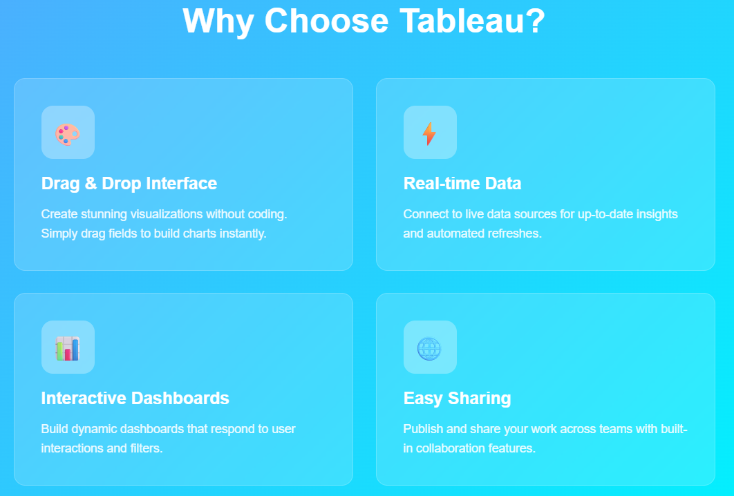
Tableau is a leading business intelligence and data visualization platform that transforms raw data into meaningful insights. Consequently, organizations worldwide use it to analyze trends, identify patterns, and communicate findings effectively. The platform’s drag-and-drop interface makes it accessible to users without extensive technical backgrounds.
Key Benefits of Using Tableau
First and foremost, Tableau offers unparalleled ease of use compared to traditional data analysis tools. Additionally, it provides:
- Interactive Dashboards: Create dynamic visualizations that respond to user inputs
- Real-time Data Connection: Connect to live data sources for up-to-date insights
- Collaborative Features: Share findings with team members seamlessly
- Scalability: Handle datasets ranging from small spreadsheets to enterprise-level databases
Moreover, Tableau’s visual approach helps users identify patterns that might remain hidden in traditional spreadsheet analysis. Subsequently, this leads to faster decision-making and improved business outcomes.
Getting Started: Setting Up Your Tableau Environment
Installing Tableau Desktop
Before diving into visualization creation, you’ll need to install Tableau Desktop. First, visit the official Tableau website and download the appropriate version for your operating system. Then, follow the installation wizard to complete the setup process.
Alternatively, you can start with Tableau Public, which is free and perfect for learning purposes. However, keep in mind that Tableau Public requires you to save your work online, making it visible to others.
Understanding the Tableau Interface
Once you’ve launched Tableau, you’ll encounter several key areas:
- Data Pane: Located on the left side, this area displays your data source and available fields
- Worksheet: The central canvas where you build your visualizations
- Shelves: Horizontal and vertical areas where you drag fields to create charts
- Marks Card: Controls the appearance and behavior of your visualization elements
Furthermore, the interface includes various toolbars and menus that provide access to advanced features and customization options.
Preparing Your Data for Visualization
Choosing the Right Data Source
Successful visualization begins with proper data preparation. Initially, you’ll need to select an appropriate dataset that aligns with your analytical goals. Tableau supports numerous data sources, including:
- Excel spreadsheets
- CSV files
- SQL databases
- Cloud-based platforms
- Web data connectors
For beginners, starting with a simple Excel file or CSV dataset is recommended. Subsequently, you can explore more complex data sources as your skills develop.
Data Quality Considerations
Before creating visualizations, ensure your data meets quality standards. Specifically, check for:
- Missing Values: Identify and handle blank cells appropriately
- Data Types: Verify that numbers are recognized as numeric values
- Consistency: Ensure uniform formatting across similar fields
- Outliers: Identify unusual values that might skew your analysis
Additionally, clean data produces more accurate and meaningful visualizations, ultimately leading to better insights.
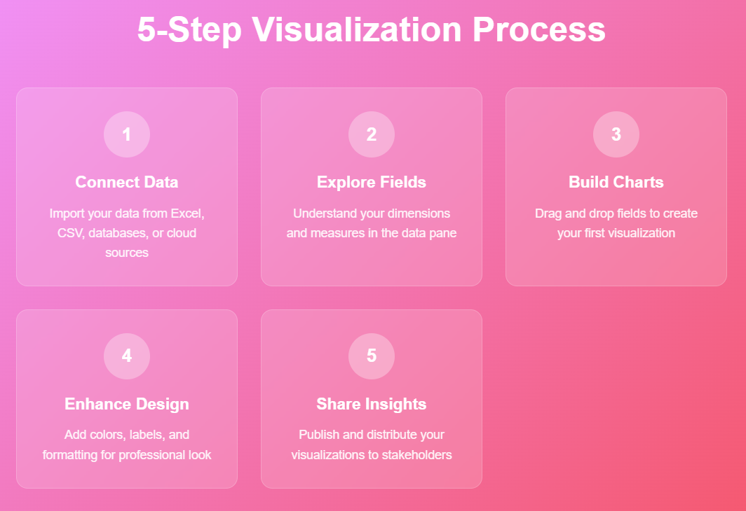
Creating Your First Tableau Visualization
Step 1: Connecting to Your Data
To begin, launch Tableau and select “Connect to Data” from the start page. Then, choose your data source type and navigate to your file location. Once connected, Tableau will display a preview of your data in the Data Source tab.
Next, examine the data structure and field types. Tableau automatically assigns data types, but you may need to adjust them manually. For instance, dates should be recognized as date fields, while categorical data should be marked as dimensions.
Step 2: Building Your First Chart
Now, let’s create a simple bar chart to demonstrate basic visualization principles. First, drag a categorical field (dimension) to the Columns shelf. Then, drag a numerical field (measure) to the Rows shelf. Immediately, Tableau will generate a basic bar chart.
For example, if you’re working with sales data:
- Drag “Product Category” to Columns
- Drag “Sales” to Rows
- Observe the automatically generated bar chart
Step 3: Enhancing Your Visualization
Once you have a basic chart, you can enhance it with additional features. Specifically, try these improvements:
- Add Color: Drag a field to the Color mark to differentiate categories
- Include Labels: Drag a measure to the Label mark to display values
- Adjust Size: Use the Size mark to vary element sizes based on data values
Moreover, these enhancements make your visualization more informative and visually appealing.
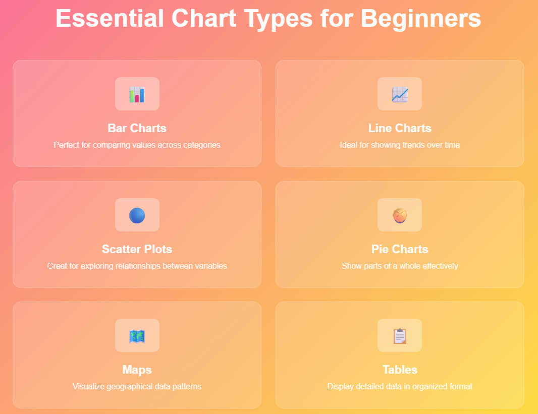
Essential Chart Types for Beginners
Bar Charts: The Foundation of Data Visualization
Bar charts represent one of the most fundamental visualization types. Therefore, mastering bar charts provides a solid foundation for more complex visualizations. They’re particularly effective for comparing values across categories.
To create variations:
- Horizontal bars: Swap the fields between Columns and Rows shelves
- Stacked bars: Add a dimension to the Color mark
- Grouped bars: Place multiple dimensions on the same shelf
Line Charts: Tracking Trends Over Time
Line charts excel at showing trends and changes over time. Consequently, they’re essential for temporal data analysis. To create a line chart, place a date field on Columns and a measure on Rows.
Furthermore, line charts become more powerful when you:
- Add multiple measures to compare trends
- Use different colors for various data series
- Include reference lines to highlight benchmarks
Scatter Plots: Exploring Relationships
Scatter plots help identify correlations between two numerical variables. Additionally, they’re valuable for outlier detection and pattern recognition. Create scatter plots by placing measures on both Columns and Rows shelves.
To enhance scatter plots:
- Adjust mark size based on a third variable
- Use color to represent categorical groupings
- Add trend lines to highlight correlations
Advanced Features for Better Visualizations
Filters: Focusing on Relevant Data
Filters allow you to focus on specific subsets of your data. Moreover, they make your visualizations more interactive and user-friendly. To add filters, drag fields to the Filters shelf and configure the filter conditions.
Interactive filters enable users to:
- Select specific time periods
- Choose relevant categories
- Adjust value ranges dynamically
Calculated Fields: Extending Your Analysis
Calculated fields extend Tableau’s analytical capabilities by creating new measures or dimensions. Furthermore, they enable custom calculations that aren’t available in your original dataset.
Common calculated field examples include:
- Profit margins (Profit/Sales)
- Year-over-year growth rates
- Custom categorizations based on existing fields
Formatting: Making Your Visualizations Professional
Proper formatting transforms basic charts into professional-quality visualizations. Subsequently, well-formatted charts communicate more effectively and maintain audience engagement.
Key formatting considerations:
- Color schemes: Choose colors that enhance readability
- Fonts: Use consistent, professional typography
- Spacing: Ensure adequate white space for clarity
- Titles: Write descriptive, informative titles
Building Interactive Dashboards
Combining Multiple Visualizations
Dashboards combine multiple charts into comprehensive analytical views. Therefore, they provide holistic insights by presenting related visualizations together. Start by creating individual worksheets, then combine them on a dashboard.
Effective dashboard design principles:
- Logical flow: Arrange visualizations in a logical sequence
- Consistent sizing: Maintain proportional chart sizes
- Clear navigation: Provide intuitive user controls
- Responsive design: Ensure compatibility across devices
Adding Interactivity
Interactive elements transform static dashboards into dynamic analytical tools. Consequently, users can explore data independently and discover personalized insights.
Common interactive features include:
- Filter actions: Allow selections in one chart to filter others
- Highlight actions: Emphasize related data points across visualizations
- URL actions: Link to external resources or detailed reports
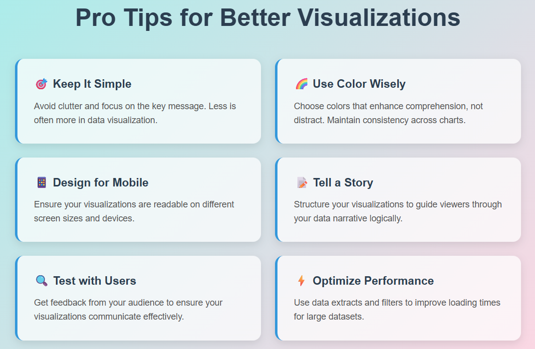
Best Practices for Effective Visualizations
Design Principles
Effective visualizations follow established design principles that enhance comprehension and engagement. Therefore, consider these guidelines when creating your charts:
- Simplicity: Avoid unnecessary complexity that might confuse viewers
- Clarity: Ensure all elements serve a specific purpose
- Consistency: Maintain uniform styling across related visualizations
- Accuracy: Verify that visual representations match underlying data
Avoiding Common Mistakes
Beginners often make predictable mistakes that reduce visualization effectiveness. Consequently, being aware of these pitfalls helps you create better charts:
- Misleading scales: Ensure axis scales accurately represent data ranges
- Inappropriate chart types: Choose chart types that match your data story
- Information overload: Avoid cramming too much information into single visualizations
- Poor color choices: Select colors that enhance rather than hinder comprehension
Sharing and Publishing Your Work
Tableau Server and Tableau Online
Once you’ve created compelling visualizations, sharing them with stakeholders becomes crucial. Furthermore, Tableau provides several options for publishing and distributing your work.
Tableau Server offers on-premises deployment for organizations requiring data security. Alternatively, Tableau Online provides cloud-based sharing capabilities with similar functionality.
Export Options
Tableau supports various export formats to accommodate different sharing needs:
- PDF: Ideal for static reports and presentations
- Image files: Suitable for embedding in documents or websites
- Excel: Enables further analysis in spreadsheet applications
- PowerPoint: Facilitates integration with presentation materials
Troubleshooting Common Issues
Data Connection Problems
Beginners frequently encounter data connection challenges. Therefore, understanding common solutions helps maintain productivity:
- File path issues: Ensure data files remain in their original locations
- Permission errors: Verify appropriate access rights for data sources
- Format incompatibilities: Check that data formats match Tableau’s requirements
Performance Optimization
Large datasets can impact visualization performance. Consequently, implementing optimization strategies ensures smooth user experiences:
- Data extracts: Create optimized data snapshots for faster loading
- Aggregation: Summarize data at appropriate levels
- Filtering: Limit data scope to relevant subsets
Learning Resources and Next Steps
Official Tableau Resources
Tableau provides extensive learning materials for users at all skill levels. Moreover, these resources are regularly updated with new features and best practices:
- Tableau Training: Comprehensive courses covering fundamental to advanced topics
- Community Forums: User-driven discussions and problem-solving
- Documentation: Detailed technical references and tutorials
Building Your Skills
Continuous learning accelerates your Tableau expertise development. Therefore, consider these growth strategies:
- Practice regularly: Work with different datasets to expand your experience
- Join user groups: Connect with other Tableau users in your area
- Attend conferences: Participate in Tableau-focused events and workshops
- Experiment with features: Explore advanced capabilities as your confidence grows
Conclusion: Your Journey to Data Visualization Excellence
Creating effective visualizations in Tableau requires practice, patience, and continuous learning. However, the investment pays dividends through improved analytical capabilities and enhanced communication skills. Furthermore, mastering Tableau opens doors to numerous career opportunities in data analysis and business intelligence.
Remember that great visualizations tell compelling stories with data. Therefore, focus on understanding your audience’s needs and crafting visualizations that provide actionable insights. Additionally, stay curious and continue exploring Tableau’s extensive feature set as you develop your expertise.
Finally, the journey from beginner to expert happens gradually through consistent practice and experimentation. Consequently, embrace challenges as learning opportunities and celebrate your progress along the way.
References:
- Tableau Official Documentation
- Tableau Community Forums
- Tableau Public Gallery
- Data Visualization Best Practices – Harvard Business Review
- Storytelling with Data by Cole Nussbaumer Knaflic
- Power BI vs Tableau