Unlock Hidden Insights: The Ultimate Guide to Model Evaluation Metrics

Table of Contents
ToggleMastering Model Evaluation: ROC-AUC, Confusion Matrix & Log Loss for Unmatched Accuracy
In the world of machine learning, a model is only as good as our ability to evaluate it. Like a chef who must taste their creation before serving it, data scientists need reliable ways to measure model performance before deployment. The difference between a good and great model often comes down to understanding the nuances of evaluation metrics.
Today, I’ll walk you through three powerful techniques that help us peer behind the curtain of model performance: ROC-AUC, confusion matrices, and log loss. These metrics tell different stories about our models, each with unique insights that can guide our decision-making process.
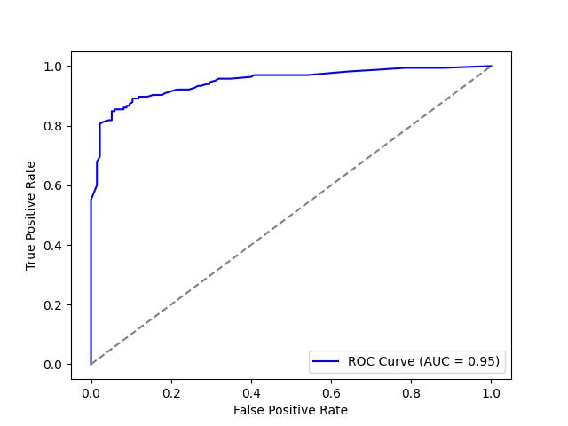
ROC-AUC: The Signal-to-Noise Detective
Imagine you’re developing a medical test for a disease. You want a test that correctly identifies people who have the disease (true positives) while minimizing false alarms (false positives). This fundamental trade-off is exactly what Receiver Operating Characteristic (ROC) curves help us visualize.
What is ROC-AUC?
The ROC curve plots two critical rates across different classification thresholds:
- True Positive Rate (Sensitivity): The proportion of actual positives correctly identified
- False Positive Rate (1-Specificity): The proportion of actual negatives incorrectly classified as positive
The Area Under the Curve (AUC) measures the entire two-dimensional area under the ROC curve, providing a single value between 0 and 1. An AUC of 0.5 indicates a model with no discriminative ability (equivalent to random guessing), while 1.0 represents perfect classification.
The Mathematical Foundation
For those who appreciate the technical details, here’s how we calculate these rates:
- True Positive Rate = TP / (TP + FN)
- False Positive Rate = FP / (FP + TN)
Where TP = True Positives, FN = False Negatives, FP = False Positives, and TN = True Negatives.
When to Use?
ROC-AUC is particularly valuable in these scenarios:
- When the costs of false positives and false negatives might change over time
- For imbalanced datasets, as ROC-AUC is insensitive to class distribution
- When comparing multiple models at various operating points
- In medical diagnostics, fraud detection, and any domain where ranking predictions is important
However, ROC-AUC isn’t perfect. If your positive class is rare (like in fraud detection where <1% of transactions are fraudulent), the metric might not reflect real-world performance effectively. In such cases, precision-recall curves might be more informative.
Example: Calculating ROC-AUC in Python
					from sklearn.metrics import roc_curve, auc
from sklearn.model_selection import train_test_split
from sklearn.ensemble import RandomForestClassifier
from sklearn.datasets import make_classification
import matplotlib.pyplot as plt

# Create synthetic dataset
X, y = make_classification(n_samples=1000, n_features=10, random_state=42)
X_train, X_test, y_train, y_test = train_test_split(X, y, test_size=0.3, random_state=42)

# Train model
model = RandomForestClassifier()
model.fit(X_train, y_train)

# Get predicted probabilities
y_scores = model.predict_proba(X_test)[:, 1]

# Compute ROC curve
fpr, tpr, _ = roc_curve(y_test, y_scores)
roc_auc = auc(fpr, tpr)

# Plot ROC curve
plt.figure()
plt.plot(fpr, tpr, color='blue', label=f'ROC Curve (AUC = {roc_auc:.2f})')
plt.plot([0, 1], [0, 1], color='gray', linestyle='--')
plt.xlabel('False Positive Rate')
plt.ylabel('True Positive Rate')
plt.legend()
plt.show()
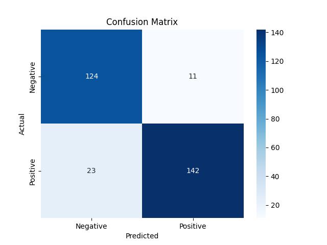
Confusion Matrix: The Detailed Performance Report
While ROC-AUC provides a comprehensive view of model performance across thresholds, sometimes we need to examine a specific decision threshold in detail. This is where the confusion matrix shines – it’s like getting an itemized receipt of your model’s predictions.
What is a Confusion Matrix?
A confusion matrix is a table that describes the performance of a classification model by breaking down predictions into four categories:
- True Positives (TP): Cases correctly predicted as positive
- False Positives (FP): Cases incorrectly predicted as positive (Type I error)
- True Negatives (TN): Cases correctly predicted as negative
- False Negatives (FN): Cases incorrectly predicted as negative (Type II error)
These four values form the foundation for many other metrics including accuracy, precision, recall, and F1-score.
Derived Metrics from Confusion Matrix
From the confusion matrix, we can calculate numerous performance metrics:
- Accuracy: (TP + TN) / (TP + TN + FP + FN)
- Precision: TP / (TP + FP)
- Recall (Sensitivity): TP / (TP + FN)
- Specificity: TN / (TN + FP)
- F1 Score: 2 * (Precision * Recall) / (Precision + Recall)
When to Use Confusion Matrices
Confusion matrices are particularly valuable in these scenarios:
- When the costs of different types of errors vary significantly
- For imbalanced datasets where accuracy can be misleading
- To identify specific patterns of misclassification
- When detailed error analysis is required to improve the model
- In multi-class classification problems to understand inter-class confusion
Example: Creating a Confusion Matrix in Python
					from sklearn.metrics import confusion_matrix, classification_report
import seaborn as sns
import numpy as np

# Generate predictions
y_pred = model.predict(X_test)

# Compute confusion matrix
cm = confusion_matrix(y_test, y_pred)

# Plot confusion matrix
sns.heatmap(cm, annot=True, fmt='d', cmap='Blues', xticklabels=['Negative', 'Positive'], yticklabels=['Negative', 'Positive'])
plt.xlabel('Predicted')
plt.ylabel('Actual')
plt.title('Confusion Matrix')
plt.show()

# Print detailed classification report
print(classification_report(y_test, y_pred))
Log Loss: The Probability Perfectionist
While ROC-AUC and confusion matrices focus on binary outcomes, log loss (cross-entropy loss) evaluates the quality of predicted probabilities. Think of it as measuring not just whether your model is right, but how confident it is in its predictions.
What is Log Loss?
Log loss measures the performance of a classification model where the prediction output is a probability value between 0 and 1. The goal is to minimize this value, with perfect predictions resulting in a log loss of 0.
Mathematically, log loss is defined as:
For binary classification:
\text{Log Loss} = -\frac{1}{N} \sum_{i=1}^{N} \left[ y_i \log(p_i) + (1 - y_i) \log(1 - p_i) \right]Where:
- N: The number of samples.
- yi: The actual label for the ii-th sample.
- pi: The predicted probability for the ii-th sample.
For multi-class problems, it extends to:
\text{Log Loss} = -\frac{1}{N} \sum_{i=1}^{N} \sum_{j=1}^{M} \left[ y_{ij} \log(p_{ij}) \right]
Where:
- N: The number of samples.
- M: The number of classes (for multi-class classification).
- yij: The actual label for the ii-th sample and jj-th class.
- pij: The predicted probability for the ii-th sample and jj-th class.
Example: Calculating Log Loss in Python
					from sklearn.metrics import log_loss

# Compute Log Loss
y_prob = model.predict_proba(X_test)
log_loss_score = log_loss(y_test, y_prob)
print(f'Log Loss: {log_loss_score:.4f}')
Code Examples
ROC-AUC Practical Implementation
					import pandas as pd
import numpy as np
from sklearn.model_selection import train_test_split
from sklearn.ensemble import RandomForestClassifier
from sklearn.metrics import roc_curve, auc, roc_auc_score
import matplotlib.pyplot as plt
from sklearn.datasets import load_diabetes
from sklearn.preprocessing import StandardScaler

# Prepare data - we'll use the diabetes dataset but convert it to a binary classification problem
diabetes = load_diabetes()
X = diabetes.data
# Creating a binary target (for simplicity: above median = 1, below = 0)
y = (diabetes.target > np.median(diabetes.target)).astype(int)

# Split the data
X_train, X_test, y_train, y_test = train_test_split(X, y, test_size=0.3, random_state=42)

# Scale features
scaler = StandardScaler()
X_train_scaled = scaler.fit_transform(X_train)
X_test_scaled = scaler.transform(X_test)

# Train a model - we'll use Random Forest
rf_model = RandomForestClassifier(n_estimators=100, random_state=42)
rf_model.fit(X_train_scaled, y_train)

# Predict probabilities
y_probs = rf_model.predict_proba(X_test_scaled)[:, 1]

# Calculate ROC curve and AUC
fpr, tpr, thresholds = roc_curve(y_test, y_probs)
roc_auc = auc(fpr, tpr)

# Also calculate using the sklearn function
sklearn_auc = roc_auc_score(y_test, y_probs)

# Plot ROC curve
plt.figure(figsize=(10, 6))
plt.plot(fpr, tpr, color='darkorange', lw=2, label=f'ROC curve (area = {roc_auc:.3f})')
plt.plot([0, 1], [0, 1], color='navy', lw=2, linestyle='--')  # Diagonal representing random guess
plt.xlim([0.0, 1.0])
plt.ylim([0.0, 1.05])
plt.xlabel('False Positive Rate')
plt.ylabel('True Positive Rate')
plt.title('Receiver Operating Characteristic')
plt.legend(loc="lower right")

# Print threshold analysis
# Let's examine a few thresholds and their impact
threshold_indices = [0, len(thresholds) // 4, len(thresholds) // 2, 3 * len(thresholds) // 4, len(thresholds) - 1]
print("Threshold analysis:")
print(f"{'Threshold':<12}{'TPR':<8}{'FPR':<8}{'Precision':<12}{'F1 Score':<12}")

for idx in threshold_indices:
    # For the last index, we need to be careful because thresholds has one less element
    if idx == len(thresholds):
        idx = len(thresholds) - 1

    threshold = thresholds[idx]

    # Calculate predictions at this threshold
    y_pred = (y_probs >= threshold).astype(int)

    # Calculate metrics
    tp = np.sum((y_test == 1) & (y_pred == 1))
    fp = np.sum((y_test == 0) & (y_pred == 1))
    fn = np.sum((y_test == 1) & (y_pred == 0))
    tn = np.sum((y_test == 0) & (y_pred == 0))

    tpr_val = tp / (tp + fn) if (tp + fn) > 0 else 0
    fpr_val = fp / (fp + tn) if (fp + tn) > 0 else 0
    precision = tp / (tp + fp) if (tp + fp) > 0 else 0
    f1 = 2 * (precision * tpr_val) / (precision + tpr_val) if (precision + tpr_val) > 0 else 0

    print(f"{threshold:.3f}      {tpr_val:.3f}   {fpr_val:.3f}   {precision:.3f}       {f1:.3f}")

print(f"\nFinal ROC AUC: {roc_auc:.4f}")
print(f"sklearn's ROC AUC: {sklearn_auc:.4f}")

# Let's also demonstrate the impact of different models on the same dataset
from sklearn.linear_model import LogisticRegression
from sklearn.svm import SVC

# Train a logistic regression model
lr_model = LogisticRegression(random_state=42)
lr_model.fit(X_train_scaled, y_train)
lr_probs = lr_model.predict_proba(X_test_scaled)[:, 1]
lr_fpr, lr_tpr, _ = roc_curve(y_test, lr_probs)
lr_auc = auc(lr_fpr, lr_tpr)

# Train an SVM model with probability estimates
svm_model = SVC(probability=True, random_state=42)
svm_model.fit(X_train_scaled, y_train)
svm_probs = svm_model.predict_proba(X_test_scaled)[:, 1]
svm_fpr, svm_tpr, _ = roc_curve(y_test, svm_probs)
svm_auc = auc(svm_fpr, svm_tpr)

# Plot comparison of models
plt.figure(figsize=(10, 6))
plt.plot(fpr, tpr, color='darkorange', lw=2, label=f'Random Forest (AUC = {roc_auc:.3f})')
plt.plot(lr_fpr, lr_tpr, color='green', lw=2, label=f'Logistic Regression (AUC = {lr_auc:.3f})')
plt.plot(svm_fpr, svm_tpr, color='red', lw=2, label=f'SVM (AUC = {svm_auc:.3f})')
plt.plot([0, 1], [0, 1], color='navy', lw=2, linestyle='--')
plt.xlim([0.0, 1.0])
plt.ylim([0.0, 1.05])
plt.xlabel('False Positive Rate')
plt.ylabel('True Positive Rate')
plt.title('ROC Curve Comparison of Different Models')
plt.legend(loc="lower right")
plt.show()
Confusion Matrix Practical Implementation
					import pandas as pd
import numpy as np
from sklearn.model_selection import train_test_split
from sklearn.ensemble import RandomForestClassifier
from sklearn.metrics import confusion_matrix, classification_report, ConfusionMatrixDisplay
import matplotlib.pyplot as plt
import seaborn as sns
from sklearn.preprocessing import StandardScaler

# Generate a synthetic credit card fraud dataset
# (in reality you would load a real dataset)
np.random.seed(42)
n_samples = 10000
n_features = 10

# Create features (transaction details)
X = np.random.randn(n_samples, n_features)

# Create imbalanced target (fraud is rare, ~1%)
y = np.zeros(n_samples)
fraud_indices = np.random.choice(range(n_samples), size=int(n_samples * 0.01), replace=False)
y[fraud_indices] = 1

# Split the data
X_train, X_test, y_train, y_test = train_test_split(X, y, test_size=0.3, random_state=42, stratify=y)

# Scale features
scaler = StandardScaler()
X_train_scaled = scaler.fit_transform(X_train)
X_test_scaled = scaler.transform(X_test)

# Train a model
rf_model = RandomForestClassifier(n_estimators=100, random_state=42, class_weight='balanced')
rf_model.fit(X_train_scaled, y_train)

# Generate predictions
y_pred = rf_model.predict(X_test_scaled)
y_prob = rf_model.predict_proba(X_test_scaled)[:, 1]

# Calculate and display confusion matrix
cm = confusion_matrix(y_test, y_pred)

# Let's calculate some key metrics manually to understand them better
tn, fp, fn, tp = cm.ravel()

# Basic metrics
accuracy = (tp + tn) / (tp + tn + fp + fn)
precision = tp / (tp + fp) if (tp + fp) > 0 else 0
recall = tp / (tp + fn) if (tp + fn) > 0 else 0
specificity = tn / (tn + fp) if (tn + fp) > 0 else 0
f1 = 2 * (precision * recall) / (precision + recall) if (precision + recall) > 0 else 0

print(f"Confusion Matrix:\n{cm}")
print("\nMetrics calculated manually:")
print(f"Accuracy: {accuracy:.4f}")
print(f"Precision: {precision:.4f}")
print(f"Recall (Sensitivity): {recall:.4f}")
print(f"Specificity: {specificity:.4f}")
print(f"F1 Score: {f1:.4f}")

# Compare with sklearn's built-in report
print("\nClassification Report from sklearn:")
print(classification_report(y_test, y_pred))

# Visualize the confusion matrix
plt.figure(figsize=(10, 8))
sns.heatmap(cm, annot=True, fmt='d', cmap='Blues',
            xticklabels=['Not Fraud', 'Fraud'],
            yticklabels=['Not Fraud', 'Fraud'])
plt.ylabel('Actual')
plt.xlabel('Predicted')
plt.title('Confusion Matrix for Credit Card Fraud Detection')

# Let's also look at a normalized confusion matrix
cm_norm = confusion_matrix(y_test, y_pred, normalize='true')
plt.figure(figsize=(10, 8))
sns.heatmap(cm_norm, annot=True, fmt='.2%', cmap='Blues',
            xticklabels=['Not Fraud', 'Fraud'],
            yticklabels=['Not Fraud', 'Fraud'])
plt.ylabel('Actual')
plt.xlabel('Predicted')
plt.title('Normalized Confusion Matrix (by row)')

# Let's also demonstrate a more complex multi-class confusion matrix
# We'll create a synthetic example for customer segmentation
np.random.seed(42)
n_samples = 1000
n_features = 8

# Create features (customer attributes)
X_multi = np.random.randn(n_samples, n_features)

# Create a 4-class target (customer segments)
y_multi = np.random.choice(['Low Value', 'Medium Value', 'High Value', 'VIP'], n_samples,
                     p=[0.4, 0.3, 0.2, 0.1])

# Split the data
X_train_multi, X_test_multi, y_train_multi, y_test_multi = train_test_split(
    X_multi, y_multi, test_size=0.3, random_state=42, stratify=y_multi)

# Train a model
rf_multi = RandomForestClassifier(n_estimators=100, random_state=42)
rf_multi.fit(X_train_multi, y_train_multi)

# Generate predictions
y_pred_multi = rf_multi.predict(X_test_multi)

# Calculate and display confusion matrix
cm_multi = confusion_matrix(y_test_multi, y_pred_multi)
classes = np.unique(y_test_multi)

# Visualize the multi-class confusion matrix
plt.figure(figsize=(12, 10))
sns.heatmap(cm_multi, annot=True, fmt='d', cmap='Blues',
            xticklabels=classes, yticklabels=classes)
plt.ylabel('Actual Customer Segment')
plt.xlabel('Predicted Customer Segment')
plt.title('Multi-class Confusion Matrix for Customer Segmentation')

# Normalized version
cm_multi_norm = confusion_matrix(y_test_multi, y_pred_multi, normalize='true')
plt.figure(figsize=(12, 10))
sns.heatmap(cm_multi_norm, annot=True, fmt='.2%', cmap='Blues',
            xticklabels=classes, yticklabels=classes)
plt.ylabel('Actual Customer Segment')
plt.xlabel('Predicted Customer Segment')
plt.title('Normalized Multi-class Confusion Matrix for Customer Segmentation')

# Using sklearn's ConfusionMatrixDisplay for pretty visualization
fig, ax = plt.subplots(figsize=(10, 8))
disp = ConfusionMatrixDisplay(confusion_matrix=cm_multi, display_labels=classes)
disp.plot(cmap='Blues', ax=ax, values_format='d')
plt.title('Customer Segmentation Confusion Matrix (sklearn display)')
plt.show()
Log Loss Practical Implementation
					import pandas as pd
import numpy as np
from sklearn.model_selection import train_test_split
from sklearn.feature_extraction.text import CountVectorizer, TfidfVectorizer
from sklearn.linear_model import LogisticRegression
from sklearn.metrics import log_loss, accuracy_score
import matplotlib.pyplot as plt
from sklearn.calibration import CalibrationDisplay

# Create a synthetic sentiment analysis dataset
np.random.seed(42)
n_samples = 1000

# Create simple synthetic reviews (in reality you'd use actual text data)
positive_phrases = ["great", "excellent", "amazing", "best", "wonderful", "good", "loved"]
negative_phrases = ["terrible", "awful", "worst", "bad", "poor", "disappointing", "hate"]

reviews = []
sentiments = []

for _ in range(n_samples):
    if np.random.random() > 0.5:
        # Generate positive review
        n_words = np.random.randint(5, 15)
        review = ["The"] + [np.random.choice(positive_phrases) for _ in range(np.random.randint(1, 4))]
        review += [np.random.choice(["movie", "product", "service", "experience"]) for _ in range(1)]
        review += ["was"] + [np.random.choice(positive_phrases) for _ in range(np.random.randint(1, 3))]
        sentiment = 1
    else:
        # Generate negative review
        n_words = np.random.randint(5, 15)
        review = ["The"] + [np.random.choice(negative_phrases) for _ in range(np.random.randint(1, 4))]
        review += [np.random.choice(["movie", "product", "service", "experience"]) for _ in range(1)]
        review += ["was"] + [np.random.choice(negative_phrases) for _ in range(np.random.randint(1, 3))]
        sentiment = 0

    reviews.append(" ".join(review))
    sentiments.append(sentiment)

# Create DataFrame
data = pd.DataFrame({
    'review': reviews,
    'sentiment': sentiments
})

# Split the data
X_train, X_test, y_train, y_test = train_test_split(
    data['review'], data['sentiment'], test_size=0.3, random_state=42)

# Feature extraction with TF-IDF
tfidf = TfidfVectorizer(max_features=1000)
X_train_tfidf = tfidf.fit_transform(X_train)
X_test_tfidf = tfidf.transform(X_test)

# Train a logistic regression model
lr_model = LogisticRegression(random_state=42)
lr_model.fit(X_train_tfidf, y_train)

# Generate probability predictions
y_prob = lr_model.predict_proba(X_test_tfidf)

# Calculate log loss
ll = log_loss(y_test, y_prob)
print(f"Log Loss: {ll:.4f}")

# Compare with a model that makes the same binary predictions but with different confidence levels
# Let's artificially create two more sets of predictions with the same accuracy but different confidence
y_pred_binary = lr_model.predict(X_test_tfidf)
accuracy = accuracy_score(y_test, y_pred_binary)
print(f"Accuracy: {accuracy:.4f}")

# Create overconfident predictions (push probabilities toward 0 and 1)
y_overconfident = np.copy(y_prob)
y_overconfident[:, 0] = np.where(y_overconfident[:, 0] > 0.5,
                                np.minimum(y_overconfident[:, 0] * 1.5, 0.99),
                                np.maximum(y_overconfident[:, 0] * 0.5, 0.01))
y_overconfident[:, 1] = 1 - y_overconfident[:, 0]

# Create underconfident predictions (push probabilities toward 0.5)
y_underconfident = np.copy(y_prob)
y_underconfident[:, 0] = 0.5 + (y_underconfident[:, 0] - 0.5) * 0.5
y_underconfident[:, 1] = 1 - y_underconfident[:, 0]

# Calculate log loss for each
ll_regular = log_loss(y_test, y_prob)
ll_overconfident = log_loss(y_test, y_overconfident)
ll_underconfident = log_loss(y_test, y_underconfident)

print("\nComparing different probability calibrations:")
print(f"Regular model log loss: {ll_regular:.4f}")
print(f"Overconfident model log loss: {ll_overconfident:.4f}")
print(f"Underconfident model log loss: {ll_underconfident:.4f}")

# Visualize the probability distributions
plt.figure(figsize=(15, 5))

# Original probabilities
plt.subplot(1, 3, 1)
plt.hist(y_prob[:, 1], bins=20, alpha=0.7)
plt.title(f'Regular Predictions\nLog Loss: {ll_regular:.4f}')
plt.xlabel('Predicted Prob. of Positive Class')
plt.ylabel('Count')

# Overconfident probabilities
plt.subplot(1, 3, 2)
plt.hist(y_overconfident[:, 1], bins=20, alpha=0.7)
plt.title(f'Overconfident Predictions\nLog Loss: {ll_overconfident:.4f}')
plt.xlabel('Predicted Prob. of Positive Class')

# Underconfident probabilities
plt.subplot(1, 3, 3)
plt.hist(y_underconfident[:, 1], bins=20, alpha=0.7)
plt.title(f'Underconfident Predictions\nLog Loss: {ll_underconfident:.4f}')
plt.xlabel('Predicted Prob. of Positive Class')

plt.tight_layout()

# Demonstrate how log loss penalizes confident incorrect predictions
# Create a dataset with a single example
y_true_single = np.array([1])  # Actual class is positive

# Range of predicted probabilities
p_range = np.linspace(0.01, 0.99, 99)
log_losses = []

# Calculate log loss for each probability
for p in p_range:
    y_pred_single = np.array([[1-p, p]])  # Probability of class 1
    ll_single = log_loss(y_true_single, y_pred_single)
    log_losses.append(ll_single)

# Plot the relationship
plt.figure(figsize=(10, 6))
plt.plot(p_range, log_losses)
plt.axvline(x=0.5, color='r', linestyle='--', alpha=0.3)
plt.grid(True, alpha=0.3)
plt.title('Log Loss as a Function of Predicted Probability\n(For a Single Positive Example)')
plt.xlabel('Predicted Probability of Positive Class')
plt.ylabel('Log Loss')
plt.annotate('Random Guess (p=0.5)', xy=(0.5, log_loss(y_true_single, np.array([[0.5, 0.5]]))),
             xytext=(0.3, 1), arrowprops=dict(arrowstyle='->'))
plt.annotate('High Confidence\nCorrect Prediction', xy=(0.9, log_loss(y_true_single, np.array([[0.1, 0.9]]))),
             xytext=(0.7, 0.2), arrowprops=dict(arrowstyle='->'))
plt.annotate('High Confidence\nINCORRECT Prediction', xy=(0.1, log_loss(y_true_single, np.array([[0.9, 0.1]]))),
             xytext=(0.3, 3), arrowprops=dict(arrowstyle='->'))

# Create a calibration plot to compare the models
plt.figure(figsize=(10, 10))
CalibrationDisplay.from_predictions(
    y_test, y_prob[:, 1], name="Original model", ax=plt.gca()
)
CalibrationDisplay.from_predictions(
    y_test, y_overconfident[:, 1], name="Overconfident model", ax=plt.gca()
)
CalibrationDisplay.from_predictions(
    y_test, y_underconfident[:, 1], name="Underconfident model", ax=plt.gca()
)
plt.legend()
plt.title('Calibration Plots Comparing Different Models')
plt.show()
Conclusion
In the quest for reliable machine learning models, understanding evaluation metrics is essential. ROC-AUC, confusion matrices, and log loss each tell a different part of the performance story – from discrimination ability across thresholds to detailed error analysis to probability calibration.
By mastering these metrics, you’ll gain deeper insights into your models’ strengths and weaknesses, make more informed decisions about model selection, and ultimately build solutions that better serve your business needs.
Remember that no single metric tells the complete story. A holistic evaluation approach combines multiple metrics with domain knowledge to create models that truly deliver value. The next time you evaluate a model, consider which aspects of performance matter most for your specific application, and choose your metrics accordingly.